“A picture is worth a thousand words”
What is Data Visualization?
The pictorial format represents some form of collected data about the world which will help us in making decisions.
From a Data Scientist’s prospective, how visualization will help us?
Why Do we have to Visualize Data?
- It compresses the huge volume to easy to an understandable level.
- Many Answers, we can get in many ways in less time.
- Helps in decision-making.
How Do We Visualization?
The gestalt principle is a human perception principle that describes how we recognize and simplify complex visual patterns.
-
Principle of figure and ground

Principle of figure and ground -
Principle of similarity

Principle of similarity -
Principle of the focal point

Principle of the focal point -
Principle of continuity

Principle of continuity -
Principle of proximity

Principle of proximity -
Principle of common region

Principle of common region -
Principle of closure

7 Stages of Visualizing the Data
- Acquire: Obtaining data.
- Parse: Structuring data.
- Filter: Removing noise from data.
- Mine: Exploring the undiscovered patterns in data.
- Represent: Visualizing the data.
- Refine: Improving the visualization.
- Interact: Analysing the important one.
Data Science Process
-
Data understanding process: You can view the different format data in the following types
-
- Structured Data
- Unstructured Data
- Semi-Structured Data
2. Data preparation process:
-
- Clearing unnecessary data like duplicate, corrupt, irrelevant, and inaccurate.
- Finding the missing data
- Strategy to find the missing data.
- Relative proxy data
- Building the data pipeline
3. Modelling Process: Building a strategy for accessing data and putting it through different visualization tools.
4. Evaluation Process: Studying and evaluating the model data and finalizing the key goal statement and solution.
5. Deployment process: Applying the solution in the business.
We can compare things through
- Horizontal bar graphs

Horizontal bar graphs - Column bar graphs

Column bar graphs - Stacked bar graphs

Stacked bar graphs
A distribution chart can be used for Distribution visualization
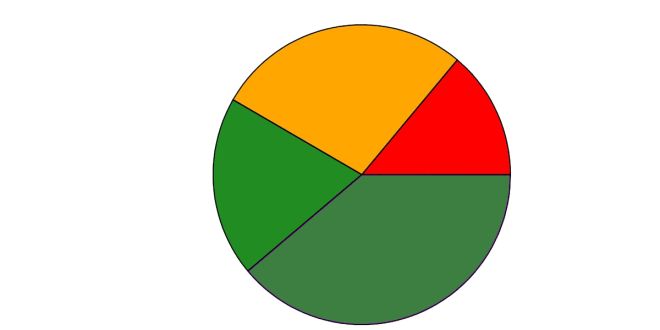
Pie chart can be used for representing the composition

Bubble charts and word clouds can be used to visualize different variables.
Data Types for Visualization
- Nominal Scale: Categories, types (Fruits: Apple, grapes, banana)
- Ordinal Scale: Orderly Representation (AAA, AA, A)
- Interval Scale: Fixed interval set (0-5, 10-50)
- Ration Scale:(Share value, Employee salary)
Effectiveness of visual Encodings
- Detection
- Assembly
- Estimation
Edward Tufte’s Design Principles
- Principle 1: Maximizing Data-Ink Ratio

Maximizing Data-Ink Ratio - Principle 2: Minimizing Chart Junk
- Unintentional optical art
- The grid
- The Duck
- Principle 3: Minimizing Lie Factor

Minimizing Lie Factor
How Do we Visualize Single Measure?
- Visualizing basic comparison charts
- Bar chart

bar-graphs - Big number

Big number - Histogram

Histogram - Box and whisker chart

Box and whisker chart
- Bar chart
- Visualization for composition
- Pie chart
- Icon array
How Do we Visualize Multiple Measure?
- Visual Comparision
- Stacked bar chart
- Box chart and boxen chart
- Violin Chart
- Strip chart and swarm chart
- Visualizing relationship
- Scatter chart and joint plot
- Pair plot
- Heat map
- Parallel coordinates chart
- Dual axis chart
- Visualizing trends
- Line chart
Various forms of unstructured text data
- Document
- Emails
- Social media
Visualizing Text Data
- .txt format
- Excel format
Visual Storytelling
” Data should be able to speak to the eyes, as eye is the best judge of proportion, being able to estimate it with more quickness and accuracy than any other of our organ”
Storytelling with Data
Secrets of Great Design
How to define the stats with story
The Neuroscience of Branding
Branding
Typography
Color Psychology
Tableau Full Course
Power BI Full Course
Additional Tips


